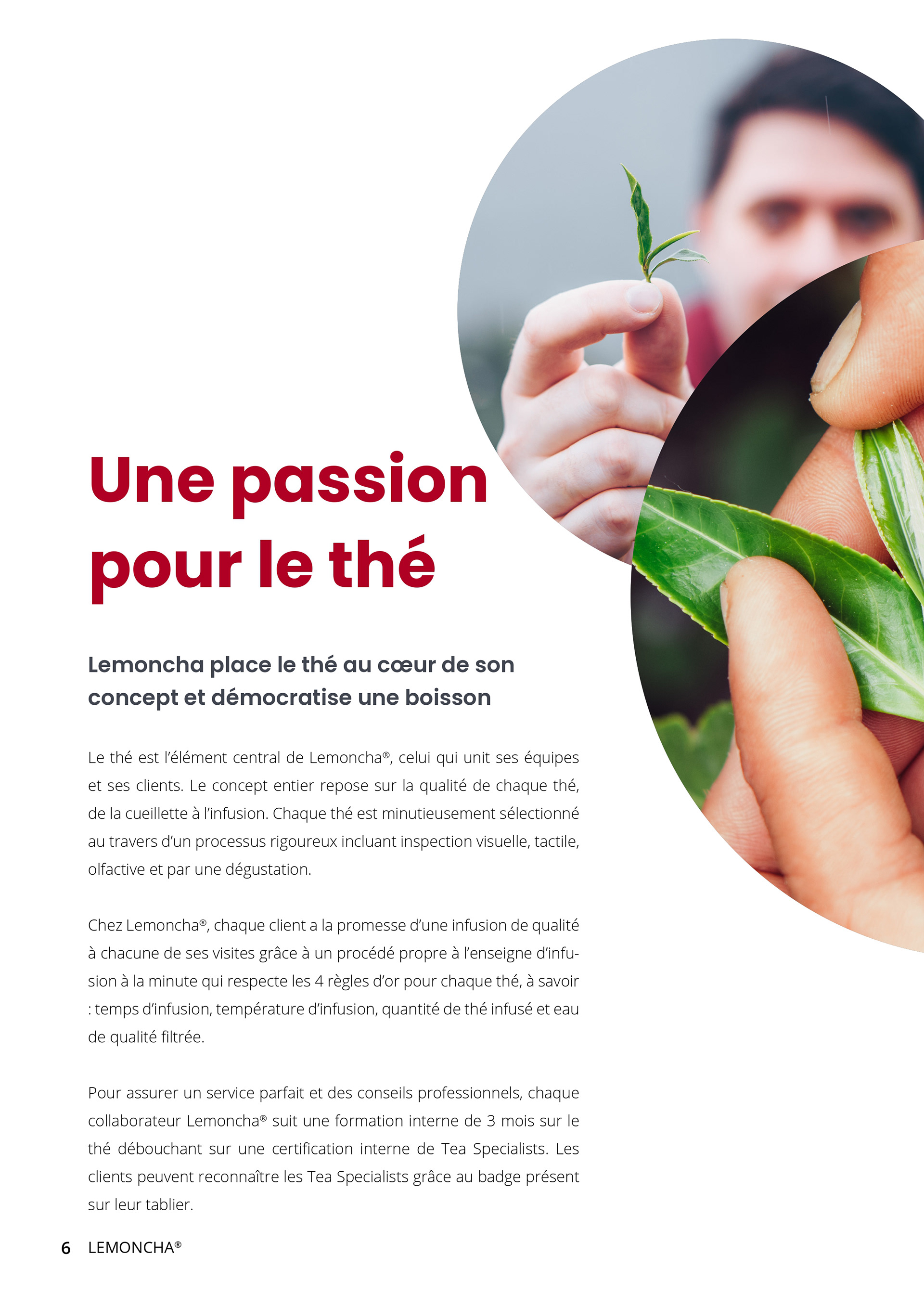
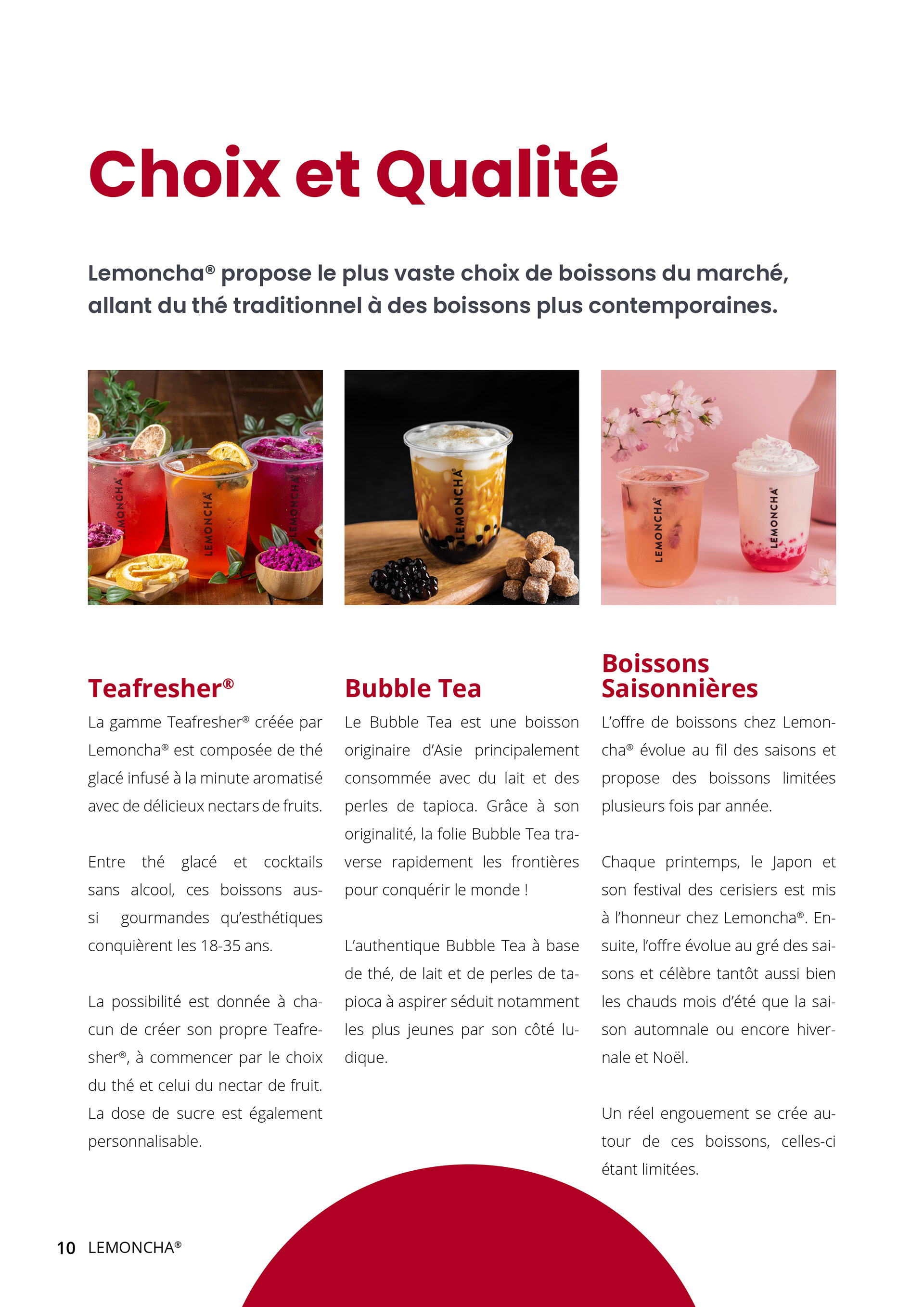
BRAND
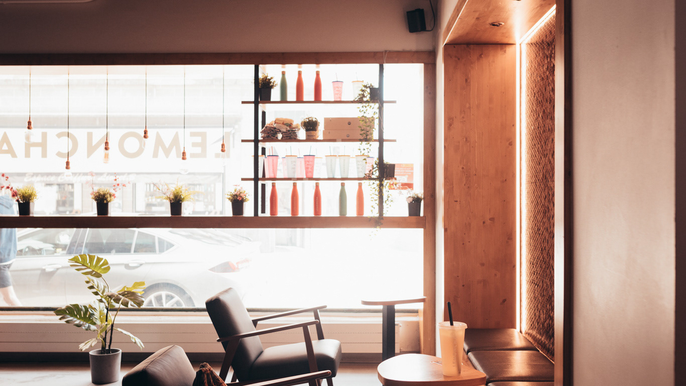
Lemoncha’s brand identity was built on a bold vision: to revolutionize the perception of tea by combining tradition with contemporary innovation. With a vibrant, nature-inspired color palette and sleek typography, the branding reflected the modern, dynamic, and youthful spirit of the company. Every detail, from the logo to the shop interiors, was designed to resonate with the freshness and creativity of Lemoncha's offerings. By blending the precision of tea preparation with the aesthetics and energy of a high-end bar, Lemoncha established itself as a pioneer in the "Modern Day Tea House" concept, setting a new standard in the industry.


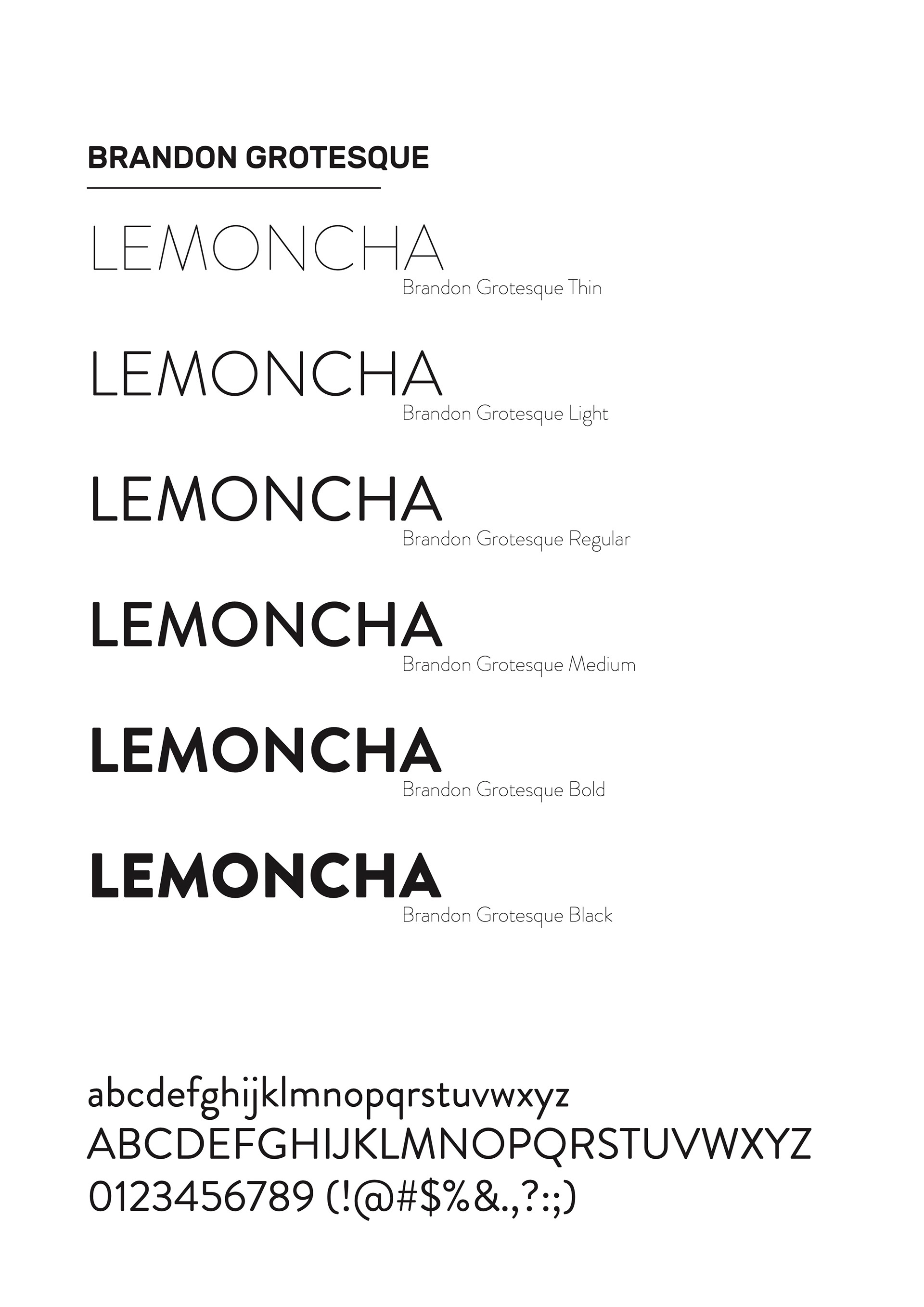
Two typefaces have been chosen for the Lemoncha rebranding : Brandon Grotesque and Rubik. Used in conjunction, they carry across the modern, light and young tone that represent Lemoncha. On the following pages you can see their wide range and read about their history.
Brandon Grotesque should only be used for the logotype or titles. Rubik light (weight 300) is used for both title and text.